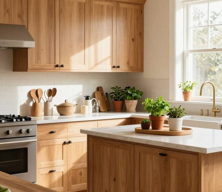
I’m excited to share twelve stunning charcoal kitchen ideas that will transform your cooking space. These designs create a sophisticated haven perfect for modern living. The deep gray tone offers the perfect balance of elegance and contemporary style.

This versatile color works beautifully in both large and small spaces. It creates cozy atmospheres in bigger rooms and makes compact areas appear larger. The rich hue pairs well with almost any material or color scheme.
Whether you’re planning a full renovation or just need inspiration, these concepts will help. They focus on creating a cohesive and inviting environment. From textured cabinets to strategic lighting, each idea enhances functionality and beauty.
The timeless appeal of charcoal gray ensures your space remains stylish for years. It serves as the perfect canvas for showcasing other design elements. Let’s explore how to create a kitchen that becomes the heart of your home.
Key Takeaways
- Charcoal gray creates a perfect blend of elegance and modern style
- Works well in both large and small kitchen spaces
- Pairs beautifully with various materials and color schemes
- Offers timeless appeal that stays stylish for years
- Can make compact spaces appear larger and more inviting
- Serves as excellent background for other design elements
- Creates a functional and beautiful cooking environment
Why Charcoal Kitchen Ideas Are Having a Moment
Modern homeowners are increasingly drawn to the elegant versatility of dark gray color schemes. This trend reflects a shift toward more sophisticated, design-forward spaces that maintain full functionality.
Dark gray offers that perfect blend of glamour and relaxation. Katie Bennett of Tom Howley describes it as “effortlessly chic.” The neutral tone serves as an ideal canvas for other elements to shine.
I’ve noticed this color’s amazing ability to make rooms feel both cozy and expansive. Larger areas gain intimacy while smaller spaces appear bigger and taller. It’s this dual quality that makes the trend so popular.
The timeless nature means your cooking area won’t look dated in a few years. This makes it a smart investment for your home. Many interior experts recommend these schemes for their welcoming atmosphere.
The color works beautifully with various materials from natural wood to metallic finishes. This versatility gives you endless design possibilities. Dark cabinetry provides the perfect backdrop for countertops and hardware to stand out.
There’s something about these spaces that feels both luxurious and approachable. They’re perfect for everyday living and entertaining guests. The current popularity reflects homeowners seeking that ideal balance of drama and subtlety.
Lift Dark Gray Cabinetry with a Mirrored Splashback
The secret to making dark cabinets feel inviting rather than oppressive lies in strategic light reflection. I love using mirrored or glass backsplashes to brighten up these deep tones.
Reflective surfaces bounce illumination around the room beautifully. This creates wonderful airiness and makes your cooking area feel more spacious.

Antiqued-glass options add character while still reflecting brightness. The Neptune design team uses this approach with stunning results.
Pair your reflective backsplash with strategic lighting for maximum impact. Golden-toned strip lighting enhances the warm glow throughout the space.
Simon Temprell from Neptune suggests combining dark cabinetry with crisp white granite. This creates a clean, streamlined appearance that balances the deep tones.
The contrast between dark cabinets and light-reflecting surfaces creates visual harmony. This approach works especially well in compact areas where every inch counts.
You get to enjoy sophisticated gray tones without sacrificing brightness. The room feels luxurious yet completely welcoming for daily use.
Reflective backsplashes also highlight other design elements beautifully. Hardware details and countertop features get extra attention from the bouncing light.
I find this combination achieves the perfect balance of drama and lightness. It transforms your cooking space into both functional and fabulous.
Add Texture with Grooved Cabinet Designs
I discovered an amazing way to enhance dark cabinetry without overwhelming the space. Vertical grooves create dynamic visual interest that transforms flat surfaces.
The Workroom’s San Francisco project demonstrates this beautifully. Sharp lines provide a fresh finish to contemporary slab designs. They subtly reference traditional tongue and groove styles.

These grooves catch light differently throughout the day. They create shifting patterns that add movement to your space. The effect brings depth to otherwise simple surfaces.
This approach maintains sleek modern aesthetics while adding tactile elements. It prevents large expanses of dark cabinetry from feeling too monolithic. The texture breaks up surfaces in the most elegant way.
Homeowners love this blend of contemporary style with traditional references. You can customize groove depth, spacing, and finish. This ensures your interior reflects your personal design preferences.
| Groove Style | Visual Effect | Best For |
|---|---|---|
| Vertical Lines | Creates height illusion | Small spaces |
| Wide Spacing | Modern minimalist look | Contemporary designs |
| Narrow Spacing | Traditional appearance | Transitional spaces |
| Deep Grooves | Strong shadow play | Dramatic interiors |
| Shallow Grooves | Subtle texture | Understated elegance |
This textural approach adds personality while maintaining sophistication. It demonstrates how simple details can transform your entire space. The grooves create visual harmony without competing with other elements.
Soften Cooler Grays with Warm Brown Tones
Many homeowners express concern about cool gray tones feeling too cold. I’ve discovered the perfect solution lies in pairing them with warm brown elements.
This combination creates a balanced and inviting atmosphere. Shannon Tate Interiors demonstrated this beautifully in a family home.

They used warm gray cabinetry with walnut accents on the range hood and handles. The peachy-toned zellige backsplash added subtle warmth.
Warm-colored quartz countertops completed the cozy feel. This approach transformed what could have been a cold space.
Natural wood tones bring essential warmth that counteracts gray’s coolness. Walnut, oak, and hickory work particularly well.
This combination excels in family kitchens. It provides sophistication while maintaining comfort and approachability.
Warm brown elements add visual interest and depth. They prevent gray from feeling flat or monotonous.
I recommend wood accents on range hoods, islands, or open shelving. This distributes warmth throughout the space.
The contrast creates a dynamic, layered look. It feels both designed and comfortably lived-in.
| Wood Type | Warmth Level | Best Pairing |
|---|---|---|
| Walnut | Rich warmth | Modern gray cabinets |
| Oak | Medium warmth | Light gray tones |
| Hickory | Strong warmth | Dark gray shades |
| Cherry | Deep warmth | Cool gray finishes |
| Maple | Subtle warmth | All gray tones |
This approach proves gray spaces don’t have to feel sterile. They can be incredibly warm and welcoming environments.
The right combination achieves modern elegance without sacrificing comfort. It’s perfect for creating a family-friendly interior.
Trim with Gold for Glamorous Sophistication
Nothing elevates a space quite like metallic accents against deep gray tones. I find that adding gold or brass elements transforms sophisticated spaces into truly glamorous environments.
The Roundhouse project demonstrates this beautifully. They used brass to frame wall cabinets with fluted glass fronts. This elegant touch was then echoed in the splashback for cohesive luxury.

Paul Welburn from Roundhouse makes an excellent point. Dark gray serves as a perfect canvas for metallic finishes. Brass, chrome, or copper accents all work wonderfully against this rich background.
Gold-toned hardware creates stunning contrast against charcoal cabinetry. Light fixtures and accessories also make each element stand out beautifully.
The warmth of gold tones complements gray’s coolness perfectly. This creates a balanced and inviting atmosphere in your cooking space.
I recommend using metallic accents strategically throughout the room. Focus on cabinet hardware, lighting fixtures, and faucets for maximum impact.
This combination creates timeless luxury that feels both opulent and approachable. It works particularly well when you want to make a design statement.
Metallic elements catch and reflect light beautifully. They add sparkle and dimension throughout the day.
Gold accents make spaces feel more personalized and luxurious. They transform functional areas into truly special environments.
| Metallic Finish | Visual Impact | Best Application |
|---|---|---|
| Polished Brass | High glamour | Cabinet hardware |
| Brushed Gold | Subtle luxury | Light fixtures |
| Antique Brass | Vintage charm | Faucets |
| Copper | Warm contrast | Decorative elements |
| Chrome | Modern crispness | Backsplash details |
This approach adds that perfect finishing touch to your interior. The metallic elements create visual interest without overwhelming the space.
I’ve seen how these accents transform entire rooms. They bring warmth and personality to sophisticated gray schemes.
The combination remains stylish year after year. It’s a design choice you’ll continue to love.
Create Striking Contrast with Your Flooring
Finding the perfect flooring can dramatically transform your charcoal kitchen’s atmosphere. The right choice creates visual harmony while balancing darker elements.

Your floor selection makes or breaks the entire interior. I always recommend creating contrast to balance dark cabinetry.
Katie Barrett suggests lighter hardwood floors or tiles with warm undertones. This approach offsets darkness while adding visual interest.
Simon Temprell from Neptune recommends walnut flooring. Its depth beautifully complements the drama of charcoal cabinetry.
Light flooring creates striking contrast that prevents heaviness. This proves especially important in smaller spaces.
The contrast between dark cabinets and light floors defines zones. It adds architectural interest in open-plan areas.
I’ve found medium-toned woods provide perfect middle ground. Oak or hickory offer contrast without being too stark.
Patterned tiles add another layer of visual interest. They provide light contrast while maintaining balance.
The right flooring ensures your space feels grounded rather than overwhelming. This approach works beautifully with natural light.
Proper selection creates perfect balance between dramatic impact and visual harmony. The play between light and dark becomes a design feature.
| Flooring Type | Contrast Level | Best For | Maintenance |
|---|---|---|---|
| Light Hardwood | High contrast | Small spaces | Moderate |
| Walnut | Medium contrast | Large areas | Easy |
| Patterned Tile | Variable contrast | Transitional spaces | Low |
| Medium Oak | Balanced contrast | Family homes | Moderate |
| Warm-toned Tile | Subtle contrast | Modern designs | Very low |
This contrast approach creates sophisticated yet inviting environments. It transforms functional areas into beautifully balanced spaces.
The flooring becomes an integral part of your design story. It works harmoniously with other elements while providing necessary visual relief.
Be Adventurous with Your Tile Choices
One of my favorite aspects of designing with gray cabinetry is the incredible tile freedom it offers. Grazzie Wilson from Ca’Pietra perfectly captures this advantage. She notes that gray’s neutrality creates endless possibilities for your surfaces.
You can truly express your personality through tile selection. Bold patterns add wonderful depth and textural interest. Bright colors create vibrant energy throughout the room.

I encourage homeowners to explore options they might avoid with other cabinet colors. The neutral backdrop provides the perfect foundation for experimentation. Patterned tiles become stunning focal points without overwhelming the space.
Gray cabinetry means there’s virtually no wrong tile choice. This flexibility allows you to create a truly personalized interior. Your selections can range from subtle neutrals to dramatic statements.
For those preferring subtle elegance, complementary neutral tones work beautifully. They create sophisticated layered looks that feel quietly luxurious. The result is a cohesive design that flows seamlessly.
Brightly colored tiles inject wonderful personality and energy. They make the space feel vibrant and uniquely yours. This approach transforms functional areas into personalized environments.
I’ve found that adventurous tile choices often become the most memorable elements. They add character while maintaining the sophisticated foundation. This balance creates spaces that feel both designed and lived-in.
- Gray’s neutrality allows any color tile to work beautifully
- Bold patterns create depth and textural interest
- Neutral backdrop enables experimentation with unusual choices
- Patterned tiles serve as focal points without competition
- Complementary neutrals create sophisticated layered looks
- Bright colors inject personality and vibrant energy
- No wrong choices exist with gray cabinetry foundation
- Adventurous tiles become the most loved design elements
- Flexibility allows true personalization of your space
- Maintains sophistication while expressing individual style
This design approach lets you create a space that reflects your unique taste. The gray foundation ensures everything feels cohesive and intentional. You achieve personal expression without sacrificing elegance.
The best part is how this flexibility future-proofs your design. You can easily update the look by changing accessories. The timeless gray cabinetry always provides a beautiful backdrop.
Use Gray as a Beautiful Foil to Natural Timber
I love how dark gray tones transform timber spaces with modern elegance. Denise Morrison of Morrison Interiors explains this creates sophisticated contrast against lighter elements. The combination delivers warmth and contemporary style simultaneously.
Natural wood brings organic texture that balances cool gray tones. This pairing creates one of the most inviting combinations for cooking areas. The contrast highlights both materials beautifully.

I always consider color undertones when matching gray with timber. Cool grays with blue bases work with ash or pine. Warmer grays complement hickory, oak, mahogany, and maple.
Walnut’s rich neutral tones work with almost any gray shade. This versatility makes it perfect for various design schemes. The wood’s natural warmth prevents spaces from feeling cold.
This approach maintains modern aesthetics while adding natural elements. The gray serves as perfect background for wood’s texture and grain. You achieve contemporary style without sacrificing warmth.
I recommend using timber on islands, range hoods, or open shelving. These applications create beautiful contrast moments throughout the room. The combination works especially well in family-friendly spaces.
- Cool gray tones pair beautifully with ash and pine woods
- Warm grays complement hickory, oak, and maple perfectly
- Walnut works with any gray due to its neutral brown tones
- Wood elements add warmth and organic texture to spaces
- Gray provides sophisticated backdrop for natural wood beauty
- Combination creates modern yet inviting atmosphere
- Works well on islands, range hoods, and open shelving
This design approach enhances rather than competes with natural materials. The result feels both intentionally designed and organically warm. It’s perfect for creating spaces that welcome everyday living.
Go Natural with Gray-Stained Wood Veneer
I’ve found a remarkable approach that combines modern aesthetics with natural warmth through gray-stained wood veneer. This technique offers the perfect balance between contemporary style and organic appeal.
The staining process lets the wood’s natural character shine through while achieving that desired gray tone. You get beautiful grain patterns that add depth and variation to your space.

This option works wonderfully for homeowners who want the gray look but prefer natural materials over painted surfaces. The wood grain prevents cabinets from appearing flat or monotonous.
Different wood species accept gray stain differently, allowing for complete customization. You can choose based on the specific finish you want to achieve in your design.
Gray-stained wood cabinetry ages beautifully while maintaining its sophisticated appearance. It develops character over time that painted surfaces simply cannot match.
This approach bridges modern gray aesthetics with traditional appreciation for natural materials. It creates interiors that feel both contemporary and timeless.
I love how this technique brings subtle variation that solid color cabinets sometimes lack. The result is a warm, inviting environment with undeniable style.
The natural texture adds visual interest while maintaining that sleek, sophisticated look. It’s perfect for creating a space that feels designed yet completely livable.
Select Countertop Surfaces Wisely
Your countertop selection makes a huge difference in dark gray spaces. I always emphasize this crucial design decision with my clients.
Mor Krisher from Caesarstone suggests lighter, natural colors for balance. Beiges, grays, and whites create beautiful contrast against deep cabinetry.

I often recommend materials like Caesarstone’s White Attica. Its blue-gray veining complements the dark gray aesthetic perfectly.
Lighter surfaces prevent the room from feeling too heavy. They create visual relief while maintaining sophisticated style.
The right choice makes your space feel brighter and more spacious. It serves as the perfect intermediary between elements.
Concrete-inspired designs in lighter gray tones work wonderfully. They add striking texture while keeping tonal harmony.
Natural stone with subtle veining adds movement and interest. It doesn’t compete with the cabinetry’s strong presence.
I consider both color and pattern when selecting materials. They should enhance rather than fight with the overall scheme.
Practical factors matter just as much as looks. Durability, maintenance, and heat resistance are equally important.
A well-chosen surface brings everything together beautifully. It creates that perfect balance you want in your home.
Try Two-Tone Color Schemes
I often recommend two-tone approaches for creating dynamic yet balanced spaces. These schemes let you incorporate additional hues without overwhelming the room.
Helen Shaw of Benjamin Moore explains why this works so well. Dark grays possess neutral, minimal characteristics that make them incredibly versatile. They serve as perfect partners for rich, jewel-inspired tones.

I love pairing deep gray with saturated colors for dramatic statements. Saffron yellow, ochre, deep petrol blue, and emerald green create stunning combinations. These pairings produce sophisticated, classic schemes that feel both inviting and atmospheric.
Two-tone approaches work particularly well when defining different zones. They help highlight architectural features while maintaining visual harmony. This method creates interest while preserving gray’s sophisticated foundation.
Grays nearing black offer particularly adaptable backdrops. Their almost-neutral quality makes them perfect for bolder color choices. This allows for personalization while benefiting from gray’s timeless qualities.
I typically use the second color on islands, lower cabinets, or accent walls. This creates focal points without competing with the main scheme. The result feels more balanced and intentionally designed than single-color approaches.
Here are my favorite applications for two-tone schemes:
- Color-blocked islands that serve as vibrant centerpieces
- Lower cabinets in contrasting hues for visual depth
- Accent walls that define cooking or dining areas
- Open shelving in complementary tones
- Range hoods or ventilation systems in statement colors
The right color pairing makes your space feel more dynamic and personalized. It adds that design-forward element while maintaining overall cohesion. This approach proves especially effective in open-plan layouts.
I’ve found that clients who choose two-tone schemes remain delighted with their choice. The combination offers both visual interest and practical flexibility. It’s a design solution that grows with your changing tastes.
Essential Materials for Your Charcoal Kitchen
Selecting quality materials makes all the difference in creating a beautiful and functional cooking area. I always emphasize how important material choices are for both appearance and daily performance.
The right selections ensure your space withstands years of use while maintaining its sophisticated look. You want materials that handle moisture, heat, and daily wear gracefully.

For cabinetry, moisture-resistant options work best in this environment. MR plywood serves well for general use throughout the room. BWP plywood provides maximum water protection for areas near sinks.
HDHMR boards offer excellent density and moisture resistance. They perform wonderfully for shutters, cabinets, and storage solutions. Their durability makes them ideal for busy family homes.
HDF and MDF provide affordable alternatives with smooth surfaces. They accept painted finishes beautifully for that seamless gray look. Their moisture resistance varies, so placement matters.
Particle boards offer eco-friendly options with good strength. They work well for certain applications where budget matters. Their affordability makes them popular for larger projects.
Countertop surfaces need careful consideration for both beauty and function. Solid surfaces provide smooth, non-porous options that resist stains. Their easy maintenance makes them practical for daily use.
Quartz offers exceptional strength and scratch resistance. Its wide color availability complements modern design preferences. The material’s durability ensures long-lasting performance.
Granite remains a favorite for its heat and stain resistance. Its natural beauty adds character to any interior space. The material stands up beautifully to busy family life.
I always balance aesthetic appeal with practical concerns. Durability, maintenance, and moisture resistance guide my recommendations. The right choices create spaces that look great and work perfectly.
Your material selections form the foundation of your entire project. They determine how well your space functions and ages over time. Thoughtful choices ensure satisfaction for years to come.
Hardware and Finishes That Elevate Charcoal Kitchens
I believe the right hardware choices transform good spaces into exceptional ones. These final touches add personality and complete your room’s aesthetic. They’re the jewelry that makes the entire outfit shine.
Silver, stainless steel, and chrome create cool, modern feelings. They complement gray tones beautifully for a sleek appearance. These finishes work well in contemporary homes.

Warm metallic accents provide stunning contrast against cool backgrounds. Gold, polished brass, and copper add glamorous sophistication. They bring warmth and richness to the space.
Black metal hardware offers a graphic, contemporary look. It creates bold statements against darker cabinetry. This choice works particularly well in modern interiors.
The right hardware balances aesthetic appeal with practical functionality. You want pieces that feel good to use daily. Comfort and durability matter as much as appearance.
Consider these popular hardware options:
- Edge profiles for minimalist, integrated appearance
- Knobs for traditional charm and easy operation
- Regular handles for comfortable grip and modern style
- Pull bars for contemporary elegance and functionality
- Recessed grips for seamless, streamlined look
I always think about how finishes will age over time. Warm metals develop beautiful patinas with use. This natural aging adds character and depth.
Mixing metal finishes creates layered, collected looks. This approach requires careful consideration for cohesion. Stick to two or three complementary finishes maximum.
Your hardware should complement other metallic elements. Light fixtures, faucets, and appliances need harmonious pairing. Consistency creates polished, intentional design.
Here’s my quick guide to metal finish pairing:
| Primary Finish | Best Complementary Finish | Style Vibe |
|---|---|---|
| Brushed Nickel | Matte Black | Modern Industrial |
| Polished Chrome | Stainless Steel | Contemporary Minimalist |
| Antique Brass | Oil-Rubbed Bronze | Traditional Elegance |
| Satin Gold | Polished Nickel | Transitional Luxury |
The final touch makes all the difference in your space. Thoughtful hardware selection elevates the entire room. It’s those details that create truly special interiors.
Design Principles for Balanced Charcoal Kitchens
Creating a beautiful cooking area requires understanding fundamental design principles. I always focus on achieving perfect harmony between all elements in the space.
The right balance makes your interior feel intentional and welcoming. It transforms a simple room into a functional work of art.

Light and dark elements need careful consideration. I balance deep tones with lighter surfaces to prevent heaviness. This creates visual interest without overwhelming the room.
Proper lighting design forms the foundation of any successful project. Layered illumination enhances functionality and atmosphere. Ambient, task, and accent lighting work together beautifully.
Scale and proportion matter in every decision. Cabinet sizes, hardware selections, and layout must work harmoniously. Each element should feel purposefully chosen for the space.
Rhythm and repetition create visual flow throughout the room. Repeated hardware finishes or consistent patterns establish cohesion. This approach makes the design feel thoughtfully planned.
Contrast principles guide my material selections. Countertops, flooring, and backsplashes balance the cabinetry perfectly. These choices prevent monotony while maintaining elegance.
Sight lines and spatial relationships deserve close attention. How the cooking area connects to adjacent spaces affects overall flow. I ensure seamless transitions throughout your home.
Unity and variety work together to create engaging environments. Consistent style elements provide cohesion while varied textures add interest. This balance prevents spaces from feeling boring.
Functional needs must align with aesthetic goals. Storage solutions, work surfaces, and traffic patterns impact daily use. I create spaces that work as beautifully as they look.
These principles ensure your project feels perfectly suited to your lifestyle. The result is a harmonious environment you’ll enjoy for years.
Conclusion: Bringing Your Charcoal Kitchen Vision to Life
I believe creating your dream space requires thoughtful planning and personal touches. The results will absolutely reward your effort and investment over time.
Take these concepts and adapt them to your specific interior and lifestyle. Gray’s versatility lets you craft a design that reflects your unique style while staying current.
The timeless quality ensures your project remains stylish for years. Don’t hesitate to mix materials and textures for depth and interest.
Consider working with design professionals who can guide your decisions. The transformation process brings you closer to the sophisticated space of your dreams.
Your finished area will become the heart of your home where memories are made. Trust the process and create an environment that enhances your daily life beautifully.